Where do you see constructive alignment and backward design used in this course or another course you are taking/have taken? Is there anywhere where it seems to be missing?
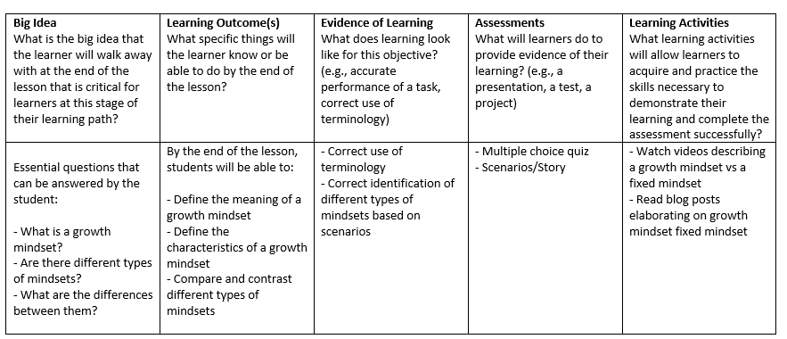
While creating a basic blueprint of the interactive learning resource for EDCI335, I used backwards design. My process primarily involved first listing out the learning outcomes for students, using Bloom’s Taxonomy verbs – this was a great help, as I was able to refine verbs and produce learner-centred outcomes that were measurable. I then looked into different resources (e.g., TedTalks, Blogs, Cartoons, etc.) that can contribute to the learning outcomes. In the end, I created an assessment that would align with the learning outcomes. I repeated this process multiple times and came to a lesson plan that was cohesive between subtopics. In the end, the order of subtopics went from growth mindset vs fixed mindset -> building resilience and embracing challenges -> identifying limiting beliefs -> positive self-talk and reframing negative thought patterns. The learning design planning template above was a result of using backwards design and constructive alignment.
Implementing backwards design earlier on in the education system such as elementary school would be greatly beneficial. Currently, I believe most educators, particularly, those who are new to the field, would cater to traditional lesson planning. With backwards design, one can reap one of many benefits such as Mayer’s Coherence principle by giving thoughtful consideration of what learning activities and resources are truly required for the student to engage with. As mentioned in Understanding by Design by Ryan Bowen, learning should be derived from the meaning of the activity, not the activity itself.
My Infographic
Referencing an old infographic from a previous course, I noticed that alignment, hierarchy, contrast, and proximity were some of my top design principles that I used. In some aspects, I do believe that the infographic could use less imagery, particularly with symbols towards the top. It’s easy to overwhelm your audience with too many items on the screen, however I do think the consistency of the elements (fonts, color palette, spacing) makes it relatively easy to process the information.
Fantastic blog post again Mary! I liked how you used backwards design and constructive alignment to come up with your learning design planning. I also think the order of subtopics was well thought-out and cohesive. I agree with you on educators, especially new ones, tend to focus on traditional lesson planning and I think this can cause them to forget the overall goal of the lesson. I enjoyed reading your blog and look forward to reading your future blogs!