Category: Assignment 1 – Blog Posts

Blog Post #5: Storytelling Video

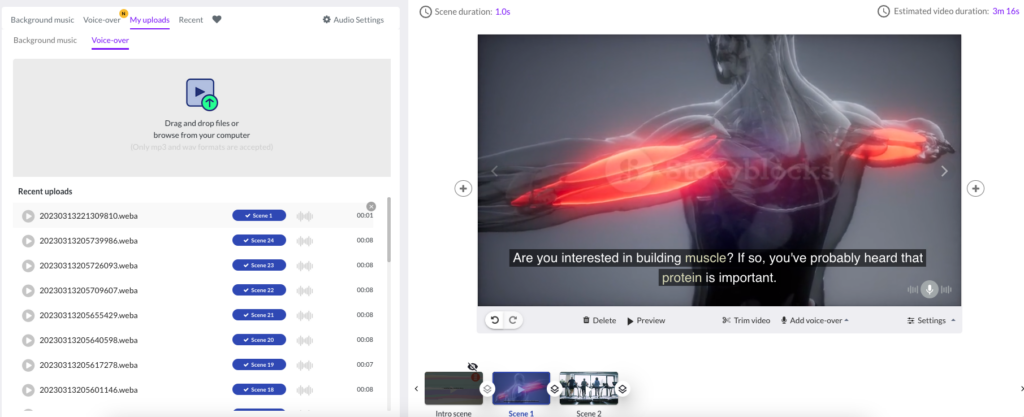
As a follow-up to last week’s preparation for publishing our storytelling video, my process involved exploring a new program called pictory.ai. This software was my video editing tool of choice which helped me compile my script, storyboard, captions, and videos into an all-in-one platform. Below is my brief educational video on the importance of protein in building muscle.

The Role of Protein in Building Muscle

My Process

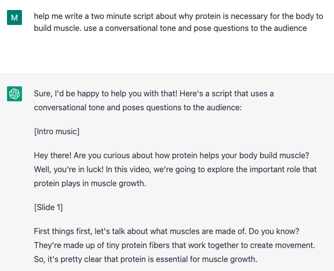
Using pictory.ai efficiently streamlined my video creation process. All it required was inserting my written script and from there, the software automatically segmented parts of my script and applied relevant snippets of videos to each section. Pictory.ai has a significant media library which allowed me to search for relevant footage that suits the topic at a particular timestamp. In addition, automatic and accurate captions were greatly beneficial. A text-to-speech feature was also available with AI voices, however, I decided to add my own voiceover to better engage my audience.

Pictory.ai workspace

Reflection

Utilizing pictory.ai is a highly automated process. Its versatile easy-to-use features saves its end-users plenty of time in terms of creating captions, inserting video footage / voiceovers, and pacing videos correctly.

I found that this combination contributed well to the dual-coding theory, where learners have the potential to remember more through visual and audio channels. However, I do believe that I also have to be careful of balancing the redundancy principle, and the modality principle, as video, text, and narration can at times overwhelm users depending on the type and amount of information that’s displayed. I’d like to further explore potential improvements with this video in assignment 3.

Blog Post #4: Brainstorming with ChatGPT and Storytelling

While preparing a storyboard for my chosen topic, I brainstormed using generative AI tools like ChatGPT. In this case, I used the following prompt: “help me write a two minute script about why protein is necessary for the body to build muscle. use a conversational tone and pose questions to the audience”. The results provided a great foundation in my script, however, I had to make several iterations such as including missing subtopics that would tie together my topic. The writing also was subpar, which I had to make edits to. This unfortunately confirmed my concern as to how AI tools such as ChatGPT can be lacking and dull in terms of writing and provide little to no “character”.

ChatGPT snippet

In terms of exploring aspects of storytelling, I enjoyed Rich McCue’s example. Keeping his video short and simple can increase levels of engagement with the audience. His use of a conversational tone and personal story also made the video slightly more relatable. I would have enjoyed the video even more if there was more variety in the short clips he used such as moving graphics instead of zooming into static images. Keeping all this in mind while planning for video production, I’d like to apply at least one of the principles of UDL guidelines in addition to McCue’s techniques such as the following:

  1. Provide Multiple Means of Representation: “Present information and content in different ways”
  2. Provide Multiple Means of Action and Expression: “Differentiate the ways that students can express what they know”
  3. Provide Multiple Means of Engagement: “Stimulate interest and motivation for learning”

Draft of Storyboard

Blog Post #3: Instructional Design and Lesson Planning / Infographic

Lesson Design Planning Template: Growth Mindset

Where do you see constructive alignment and backward design used in this course or another course you are taking/have taken? Is there anywhere where it seems to be missing?

While creating a basic blueprint of the interactive learning resource for EDCI335, I used backwards design. My process primarily involved first listing out the learning outcomes for students, using Bloom’s Taxonomy verbs – this was a great help, as I was able to refine verbs and produce learner-centred outcomes that were measurable. I then looked into different resources (e.g., TedTalks, Blogs, Cartoons, etc.) that can contribute to the learning outcomes. In the end, I created an assessment that would align with the learning outcomes. I repeated this process multiple times and came to a lesson plan that was cohesive between subtopics. In the end, the order of subtopics went from growth mindset vs fixed mindset -> building resilience and embracing challenges -> identifying limiting beliefs -> positive self-talk and reframing negative thought patterns. The learning design planning template above was a result of using backwards design and constructive alignment.

Implementing backwards design earlier on in the education system such as elementary school would be greatly beneficial. Currently, I believe most educators, particularly, those who are new to the field, would cater to traditional lesson planning. With backwards design, one can reap one of many benefits such as Mayer’s Coherence principle by giving thoughtful consideration of what learning activities and resources are truly required for the student to engage with. As mentioned in Understanding by Design by Ryan Bowen, learning should be derived from the meaning of the activity, not the activity itself.

My Infographic

Referencing an old infographic from a previous course, I noticed that alignment, hierarchy, contrast, and proximity were some of my top design principles that I used. In some aspects, I do believe that the infographic could use less imagery, particularly with symbols towards the top. It’s easy to overwhelm your audience with too many items on the screen, however I do think the consistency of the elements (fonts, color palette, spacing) makes it relatively easy to process the information.

Blog Post #2: Multimedia Design for Learning – Sketchnoting

Based on last week’s content, sketchnoting was a new term that stood out to me. Upon realizing that it’s a visual method of taking notes using drawings and written text, I decided to use this method and apply my knowledge by breaking apart a job description that I was interested in.

My personal summary in preparing for a particular job

My method of sketchnoting revolved around creating a summary / prep guide in a simple, and concise form for a job that I’m currently preparing an interview for. In this case, I reminded myself of the competencies, and general questions that I should have ideas of. By placing all of this information onto one page, I was able to gather the main qualities I should address for the job interview, and remind myself of interview techniques such as the STAR method.

The Benefits of Sketchnoting

Sketchnoting is useful for user engagement, as well as retention. It allows an individual to be creative and also to be particular with the type of content they’re including. Mayer’s theories can also be quite evident when sketchnoting. From my experience, the signaling principle helped me to focus on key concepts by highlighting specific words. In addition, knowing that I had a limited amount of space on a page helped me make use of the redundancy principle to avoid including extraneous information. For future improvements, I’d like to integrate the segmenting principle and potentially make my sketchnote interactive (i.e., allow users to flip through pages) and present information by topic instead of displaying it all on one page – this way, I can be more thorough with each section. Overall, it’s a great technique that I’d like to use for future learning experiences, particularly when it’s content-heavy as it gives me a sense of structure.

Wonder

Unfortunately, I find sketchnoting to be challenging at times. I find that I get lost in the drawings and get distracted by looking up how to draw concepts that may or may not be essential to my line of thinking. Regardless, I’m curious to know if there are formulated techniques of creating a sketchnote or if it’s more of a free form method of learning. Perhaps it depends on the content you’re working with?

Blog Post #1 – Principles of Multimedia Learning & Screencasting

Hi everyone! My name’s Mary and I’m currently in my third year of Health Information Science. In the past, I had the opportunity to take EDCI338, which I enjoyed. Fast forward to now, I have the same opportunity to take more EDCI courses! I’m looking forward to working with everyone!

My Screencast

Sample Pitch of StudyUp

For my screencast, I decided to run a sample pitch from a past course project. I used Open Broadcaster Software (OBS), which is a free open source software for video recording and live streaming. At the time I created these set of slides a semester ago, it looks like I had unknowingly applied Mayer’s theory of multimedia learning. For example, the signaling principle is demonstrated through bolded titles such as the slide that contained the characters “Quality. Scale. Reputation”. The spatial contiguity principle is also seen throughout the slide deck, as specific symbols are closely associated visually with their represented texts. Unfortunately, I did realize that the redundancy principle and the coherence principle were lacking. I believe the slide that contained information about the University of Victoria had too much text on top of my narration, which caused a lot of repetition and unnecessary information to be displayed to the user.

What Stood Out To Me

Upon reading the different principles of multimedia learning, particularly with minimizing extraneous load, it only confirms that this kind of process is challenging. Coming from the background of health informatics, I’ve learned that plenty of physicians struggle with decision fatigue and alert fatigue from health information systems due to extraneous load. That is, some health professionals are purposely overriding and disregarding important information because of the display of irrelevant and incorrect information. It may be best that healthcare can learn specifically from Mayer’s redundancy principle and signaling principle so that physicians do not have to sacrifice their cognitive load and potentially result in making poor health decisions for their patients. Fortunately, the research behind the usability of health information systems have been making gradual improvements to existing systems (e.g., electronic health records, clinical decision support systems). This has come in the form of displaying proper color schemes, box sizes, and content type that are much more useful to the end-user. In doing so, doctors have a more enjoyable time utilizing the systems available to them, all while creating better decisions.